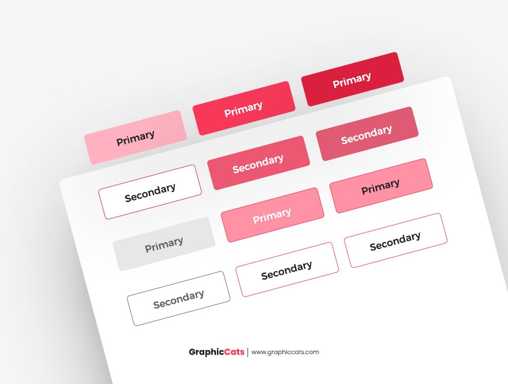
Buttons are the unsung heroes of user interface (UI) design, functioning as vital components that enable user interaction and navigation. Understanding the fundamental types of buttons is critical for a UI designer creating an intuitive and user-friendly experience. In this post, we will explore various types of buttons commonly used in user interfaces.
Primary Buttons: The Action-Takers
The primary buttons are the foundation of every UI design. They generally have a distinguishing look. Such as a bright hue, vibrant green or blue, and it quickly captures attention. These buttons represent the principal or most desired action that the user may do on a certain screen or situation. As a main button “Sign Up” on a registration page and a “Purchase Now” button on an e-commerce site.
When creating major buttons, make sure they stand out from other interface components so users can easily identify and do the necessary action.
Secondary Buttons: Providing Alternatives
Secondary buttons serve as alternatives to the primary action, providing users with options that are less visible but still significant to their journey. They are usually less noticeable in terms of appearance, with a muted or secondary color that appears alongside the primary button. A “Cancel” button, for example, is a supplementary button on a confirmation dialog that allows consumers to opt out of an activity.
To avoid user confusion, UI designers must achieve a balance in button design, ensuring that secondary buttons are less eye-catching than major buttons but still immediately discernible.
Call to Action (CTA) Buttons: Guiding User Choices
CTA buttons are designed to encourage users to take specific actions. You can find these buttons in various marketing materials, landing pages, and sales funnels. CTA buttons are often eye-catching and bold, with persuasive language to persuade visitors to click. Some examples are “Get Started,” “Subscribe Now,” and “Request a Demo.” Consider color psychology and the psychological influence of the button text when creating CTA buttons. It is critical to make the CTA button the focal point of the page and to provide appealing wording that motivates people to engage.
Ghost Buttons: Minimalist and Elegant
Because of their basic and graceful appearance, ghost buttons have grown in favor in current UI design. They have a translucent or outlined pattern and frequently use soft, low-contrast colors. When hovered over, ghost buttons lose their background color and become solid or filled. These buttons are appropriate for UIs that value a clean, unobtrusive look.
Incorporating ghost buttons necessitates careful placement and design to avoid them blending into the backdrop or becoming invisible. Due to their subtlety, they are most suitable for secondary actions or navigation elements.
Toggle Buttons: On/Off Functionality
Users can toggle between two states, such as “on” and “off,” “enable” and “disable,” or “show” and “hide.” They are frequently used for options, preferences, or filters. Toggle buttons normally have two states: active (with a filled look) and inactive (with an outline or backdrop).
Toggle button design entails making certain that the visual signals accurately reflect the current state and the available alternatives. Color changes, iconography, and text labels are examples of this.
Icon Buttons: Picture-Based Navigation
Icon buttons express unique actions or functionalities by using visual symbols or icons. People prefer them because they can convey messages quickly while conserving screen space. A magnifying glass icon for searching, a heart icon for like, or a trash can icon for deleting are common examples. When implementing icon buttons, it is critical to use easily discernible and widely identifiable icons. For greater clarity, icon buttons may additionally feature associated text labels.
Floating Action Buttons (FABs): Quick Access to Key Functions
FABs are dynamic and interactive buttons that float above the content of an app or webpage. They are frequently used to allow rapid access to critical operations, such as adding a new item or writing a message. FABs are circular, usually with an icon, and when clicked, they expand or disclose choices.
The location of FABs must be carefully considered to prevent blocking critical material. They should be easily available while without detracting from the user experience.
In conclusion, understanding the art of button design is essential for every UI designer looking to build a smooth and engaging user experience. Understanding the different sorts of buttons and their functions allows you to make educated design decisions that respond to user demands and preferences. Whether it’s the assertiveness of the primary button, the alternatives of secondary buttons, the persuasion of CTA buttons, the elegance of ghost buttons, the functionality of toggle buttons, the visual cues of icon buttons, or the quick access of FABs, each button type serves a distinct purpose in enhancing user interactions and interface navigation.


Leave a Reply