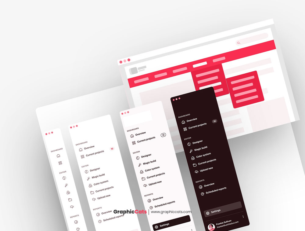
A common language is essential for efficient communication and cooperation in the ever-changing realm of UI/UX design. Our UI/UX Design Glossary continues with a focus on navigation components, illuminating the vocabulary and concepts that define the user interfaces we deal with on a daily basis.
Buttons as Interaction Catalysts
Buttons are navigation’s workhorses. They are interactive features that users may engage with via clicking or tapping. Primary buttons (major call-to-action), secondary buttons (alternative actions), and ghost buttons (minimalist, outlined buttons) are all common forms. Buttons are frequently made with eye-catching colors, shapes, and text in order to capture the attention of users.
Menus: The Navigational Roadmaps
Menus provide a systematic manner for visitors to access various areas of a website or app. The following are examples of common types:
- Dropdown Menus: Hierarchical lists emerge when users hover their mouse over or select a navigation item..
- Hamburger Menus: A small symbol that when clicked or pressed expands into a complete menu. Horizontal or vertical tabs that arrange material or functions.
- Context Menus: These are right-click or long-press menus that provide contextual alternatives.
Turning on and off switches
Switches are interactive features that enable users to switch between two states, such as “on” and “off” or “enabled” and “disabled”. They are frequently seen in settings, preferences, and filters. Switches visibly display the current status, giving users with fast feedback.
The Navigation Trail: Breadcrumbs
Breadcrumbs are a type of visual assistance that shows a user’s route around a website or app, typically in a hierarchical structure. They assist users in understanding their present location and give a simple method to return to prior levels.
Pagination: Content Dividing into Pages
Pagination is the dividing of material into many pages to facilitate browsing through vast amounts of information. To obtain more material, users can travel between pages by utilizing number links or arrow buttons.
Value Adjustment Using Sliders
Sliders allow users to choose a value from a predefined range by moving a handle along a track. Because users may select a specific value by swiping the handle.
Expanding and Collapsing Accordions
Accordions are interactive elements that allow you to expand or collapse content sections. They are useful for hierarchically arranging information, offering a summary that visitors may click to discover additional details.
Links: The Link to Other Content
When a user clicks on a link, it either takes them to another page or resource on the same website or redirects them to another website. They can take the shape of hyperlinks, buttons, or icons.
Search Bars: Quickly Locate Content
Users can use search bars to quickly access certain material or information on a website or app. So, when users enter keywords, the system produces relevant results.
Sorting and Categorizing Using Tags and Filters
Tags and filters aid in the organization and discovery of material by classifying objects based on qualities or keywords. Users may narrow down possibilities and locate what they’re looking for by using tags or filters.
Using Scrollbars to Navigate Content Overflow
Scrollbars are vertical or horizontal bars that allow users to browse through material that extends beyond the screen’s viewable area. Users may scroll by dragging the scrollbar or using their mouse wheel.
Icons for Symbolic Navigation
Icons are little graphic representations of activities or concepts. They are used to make interactions more intuitive and efficient in navigation menus, buttons, and tooltips.
Contextual Information Provided by Tooltips
Tooltips are little pop-up windows that display when a user hovers their mouse over or clicks on an element. They offer more information or context to the element, improving the user’s comprehension of its purpose.
Cards are bite-sized content containers
Cards are modular containers for bite-sized content like articles, goods, or personal profiles. They are frequently used in responsive design.
Mobile Navigation Gestures
Navigation gestures are touch-based interactions. Most commonly implemented in mobile apps. Swiping, pinching, and tapping are common actions that let users to browse and interact with the app’s UI.
A common knowledge of these navigation aspects is required for UI/UX designers, developers, and stakeholders to work successfully together to create user-friendly interfaces. With this dictionary at your disposal, you can confidently traverse the realm of UI/UX design, ensuring that your designs are intuitive and user-focused.


Leave a Reply